What makes a good website?
There is a lot of nonsense talked on the internet about web design, and also a lot of good sense. This is true of almost any subject you care to name, I suppose… Vincent Flanders has a celebrated “bad design” site webpagesthatsuck.com where he discusses some of the worst sins comitted by web designers, but the essence of his argument is simple: web sites exist to provide information or services to your visitors, not to flatter the designer’s ego.
A moment’s thought will tell you that the three most important parts of any site are content, content, and content. Other factors such as navigation and accessibility, both interpreted in the widest sense, are clearly important too, but less so.
Content
If a website doesn’t have any interesting or useful content, the chances are that no-one will ever find it with a search engine. Anyone who does get to it by accident may spend a few minutes (or more likely seconds) looking around to see why the site came up in Google, but they aren’t ever going to come back.
From my webstats, I know that the majority of people who come to markhodson.nl are looking for information about Rail3d and other Railway Software. The rest of the site, especially the Miscellaneous Thoughts area, are mostly self-indulgence. If people read them and find them interesting, I’m happy — if not then it’s only my own time I’m wasting. The somewhat diverse nature of the more random bits of the site is a problem in that it is picked up by some very odd Google queries — someone came here in October 2005 looking for correct pronunciation of chiropodist, for example. And now I have made sure that anyone else with the same social dilemma will have to waste time on this page too…
Navigation
This is a secondary issue — if it’s clear from the page I found with a search engine that I’m not going to find anything else useful on the site, then I don’t care what navigation system you use — but it is important. Visitors have to be able to see a clear pattern in the site, and not waste time navigating up and down through endless levels of menus.
The three-click test is not completely reliable, but it does give a good indication of whether your navigation system works for visitors.
You should be able to reach any page on the main site with two clicks from the homepage, if you know what you’re looking for.
See About this site for more on the structure of the site.
Accessibility
Again, a “reality check” from the webstats — more than 80% of the people who visit this site use the browser that came free with their operating system.
Like everyone else, I hate sites that tell me I should be using a different browser, a bigger or smaller screen, or a special plugin that isn’t available for my system. My standard reaction to such requests is to give up and go to another site. And I’m someone who has a good deal of experience of playing around with computers, and usually has several different browsers to choose from.
This site does not require any plugins to view the basic content (there are a few svg images that will not display on most browsers, but they aren’t terribly important).
I try to design the site so that it complies with W3C standards, and I test it in practice using both Internet Explorer and various flavours of Mozilla. The design aim is that the site should display as intended on all current browsers, and that in earlier browsers the information should appear in a reasonably logical sequence, even if it is not always a particularly elegant layout.
Font sizes are relative, so visitors should be able to view the site with larger or smaller type, as preset in their browsers. As an extra convenience there is a javascript widget for making the fontsize in the main text area bigger or smaller (see the links at the top of the page).
- Details
- Category: About markhodson.nl
I made my first website as a homepage on the site of my then ISP sometime in the 1990s (I really don't remember, but the earliest capture of it in the Internet Archive is December 1998). Since 2004, I've been with a proper hosting company and using the domain name markhodson.nl.
This particular embodiment of the site (if I decide to stick with it for a while) is running on Joomla. But frequent visitors will have noticed that the look and structure of the site tends to change radically every few years when the urge to edit seizes me. Normally these changes correspond to bursts of enthusiasm for web design, which don’t last.
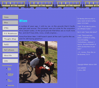
This is what it looked like in 2004, when it was still straightforward html and css:

- Details
- Category: About markhodson.nl
markhodson.nl is run by MarkHodson, who lives in the Netherlands. No, really.
The site is an unashamedly self-indulgent collection of bits and pieces that interest me. Or at least that interested me at the time I put them on the site… I hope that I can pass on some useful information together with my enthusiasm for the subjects. Feel free to contact me if you have comments or questions.
- Details
- Category: About markhodson.nl
